Monday, October 18, 2010

SOMETIMES YOUR DESIGN JUST DOESN'T WORK

Let's face it, as humans and then Designers certain designs just do not work out.  Either the customer does not want it, the Design itself is flawed, or what is designed cannot be built due to budget or physical constraints. 

For instance, I had this idea for a sconce that washed the walls in light creating a soft glow, even up the stairway.

I drew the concept at left and began working out the details.  The sconce was to be gilded in nickel, carved out of maple for strength at the base.
The interior where the bulb was located was lined with copper for an appealing glow and the wire was shielded in copper for safety.

There were only 10 of these in the hallways and staircase and you were not to see the bulb from any angle. 

The customer LOVED it and so did I (which is a bit unusual).  But, the budget was becoming prohibitive.  The construction and the gilding were coming in at $2,400 wholesale per sconce, without my fee and installation.

I reworked the design so that it had less panache and was more practical to build.  I looked into casting it in resin, cast reinforced plaster, even in metal.  The budget was getting in the way. 
So the sconce was not to be and we chose a Phoenix day plaster shell sconce with custom diffusers so that you cannot see the bulb.  They cost half the price and did not have the headaches and uncertainty of production.  For more information  mws@mwsdesignhouston.com


Friday, October 15, 2010

CREATING A FOCAL POINT IN THE MASTER BEDROOM


I talked about one of my Hawaii jobs where most of the furniture was custom made. It was satisfying to design and have built top quality furniture in the finishes that work perfectly with fabrics, wallpaper and flooring.


In this instance the Master bedroom in a contemporary house needed a focal point and the clients wanted something Hawaiian. So after visiting museums, reading, art galleries I developed this take on a Hawaiian bed made of local Koa wood with a carving of a bunch or breadfruit in the center.


The ceilings were vaulted mahogany as were the doors and shutters so we decided to go with a golden koa bed and nightstands. The lamps were Robert Kuo silver lamp from McGuire.


As always, we explored changes and like not using the ships prowl at the top of the bed, but ultimately decided the carving would be a nice touch in such a clean contemporary house. Below is the actual bed.


The grain was bookmatched and the bed has details right out of the book the Best of Hawaiian Furniture


Like most custom pieces the details are really important, not just the scale, but the carving, bookmatching and the subtle shaping that comes out during the fabrication process.
For more information mws@mwsdesinghouston.com


Wednesday, October 13, 2010

CUSTOM DINING TABLE - HAVE IT MADE

Have you seen the prices of dining tables in the showrooms lately? I was looking for one for a client, a clean line traditional table, with few constraints. I was shocked that the price the customer was going to pay for a veneered mahogany dining table with some detail , high quality, and seats 14 in a pinch, was $20k!
What was even more shocking was that the aprons did not account for a standard arm chair, the edges of the elaves were not finished, no leaf box and a myriad of other issues had me thinking, let's make it.
To add an insult, to make one of these tables correctly, they are considered custom and the quote is jacked up by $5k and the lead time was almost 6 months!

I used to have most of my dining tables made by trusted local workrooms, from sketches and drawings I developed and that fit the aesthetic and needs of my client, the constrants of the room and budget.
After developing a quote and receiving a 50% deposit I wnet to work on the detailed drawings.

The client and I started the conversation about the top, shape, details, etc. and I came up with this drawing of a fiery mahogany veneer which was available from Houston Wood Products.
Then, we started in on the base, pedestal that splits or legs. Since we wanted to seat 14 we decided to go
with a split pedestal and four steel runners for support of the 5 leaves.
The details are so important to finalizing the table before production. The base had carved acanthus leaves and a vase form reeded column. The six legs splay out and had inlaid veneer and large brass casters for ease of movement when opening the table for insertion of the leaves.


We started to fabricate the table and I sent a picture of the pieces arranged before sanding and finishing. For approval, I laid the top on the base so that the client did not have to visualize and could see the proportions.

I also made finish samples and with all of the changes the price had changed as well and with each change I informed the client what the upcharge would be. Most of the changes were approved and some were not. We did go over budget, but the table was one that would last a lifetime and was more beautiful than any we had seen in a showroom. It was also customized to her aesthetic.
The workroom, under my direction, continued by finishing the piece with Mohawk stains and clear lacquer finishes. The table top had seven layers of finish and was polished to a gloss finish. We added the hardware, made a leaf box and below are the results, in 14 weeks!


I added a bit of gilding (23kt gold leaf around the bottom edge and the little carvings on the legs for a more elegant look.
contact mws@mwsdesignsf.com for more details or to create your own.


Wednesday, October 6, 2010

GODSPELL SET DESIGN

I have finished the set of GODSPELL and the play went off to a splendid reception and turnout for both performances. The lighting really augmented the set design and created the different moods of the play, Jay Bole at Hi-Fi Doc, LLC did a fantastic job. All of the LED lights used the total power equivalent of a 70 watt incandescent bulb!


The musicians playing behind the fence and under the Houston skyline were fantastic, as four people played over 15 intruments! This was all headed up by co-director and conductor Stephen Jones.


Below Stage Left, a 70's junkyard with real and silk folage. The real folage had to be fresh for fire reasons so palm fronds and live oak, natural to the area, were chosen. Courtesy of Trammel Crow Comercial Real Estate, for they allowed me to trim a few trees from one of their vacant commercial properties.
I also had to work with Kinkaid School colors which are purple and yellow/gold. These colors actually worked well with the psychedelic color theme without upstaging the actors.


The skyline stayed lit the entire time and was a layered foam insulation from Home Depot and held together with screws and hot glue. The no VOC Benjamin Moore paint was a matte paint called Natura. The surfactant (paint) took a little longer to dry but was tougher than flat latex paint and had no smell.


Lastly, was stage right which had to mirror stage left but have completely different detail. Remember that the entire set rests on the ground and is not screwed to the walls.

Lots of wire, rope, gaffe tape, etc!


To the right is stage right.
And on to the next house, party or theater event!


Theater Set Design

I was contacted by the Kinkaid School in Houston, Texas to design and build a set for the playGodspell.
I started with a rather stark Recital Hall shown below.

In this space I had to create the set of a junkyard in which Godspell was to take place. The catch was that I was not allowed to attach any of the set to the movable walls or the main walls with screw or anything that would not mar the finishes.
Basically the background had to be made and then strapped to the movable walls, they are on wheels, 16ft tall. They are technically called choral "shells" and are made by Wenger Corporation. The shells are very nice but you cannot put weight on the front of them for fear of them tipping forward; so the set had to sit on the stage.

To create the background I spent alot of time at Home Depot and Lowe's getting corrugated fiberglass and painting it gray to look like metal. I went to the Benjamin Moore Store and found some gray primer that went on quickly and went back to Home Depot for black Weedstop black woven cloth for the background.In the center I created a Houston Skyline and backlit it with christmas lights and aluminum foil reflectors. I had a week to complete this project start to finish.

Torsten Louis, who is the set consultant was able to provide the platforms and boxes from his theatre warehouse at Kinkaid. Torsten also purchased the ready made fence from Home Depot and welded the brackets that were used to hold the fence to the platforms. Once the platforms were in place and the choral shells were placed by the Director, Dan Bishop, I could start to apply the set.

Twenty six high school performers had to come on and off stage between the shells and the four piece band was behind the fence. There was dancing and singing and lots of movement and props so everything had to be secure. The lighting provided by Hi-Fi Doc, LLC was all LED and allowed the Director to change moods quickly with the lighting. So lighting trees were set up in hidden areas. The lights had to change color quickly, flash and dim so the Technicians setup a lighting panel and computer that worked well with over 50 lighting cues and had to work with the existing lighting system in the hall for spot lights, house lights and stage lights.

I frequented auto salvage yards in North Houston and was bitten by many mesquitos loading trunk lids, hoods, doors, tires and wheels into my van. Even found a patio umbrella, kids pool and actually had to PAY for hubcaps... I will let you know how it turns out......


Tuesday, February 9, 2010

NEW INSPIRATIONS


I have been wondering what are some of the new directions and influences for interior design.

We want our projects to look like the 3D renderings we create and we want to look like our avatars. In other words dreamy.

I have a project in Miami for a restaurant and had to create furniture that fit into this 3D rendering

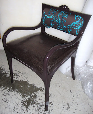
So the chairs needed to have this sensual, curved feeling but sturdy and comfortable.


The chairs and the small sofas were critical to the overall design of the restaurant. The outcome has been interesting as the wood is lacquered in dark and light wood colors (wenge and a gray maple). Like the colors in the rendering.
To mix it up a bit we created tables with the same sensuality. Single and double pedestal tables which are turned but with square tops.
We also had them steel reinforced so that they would be sturdy.
Lastly, I have started to use Mohawk waterbourne lacquers and stains on all of my projects. Really low VOC's and better for the health of the people spraying it and for the air as those fumes go right into the local atmosphere.
It takes a little longer to dry, but it is actually a more durable finish. I have been using Mohawk products for years and I am so glad that Mohawk finally came out with a product that is durable, low VOC and easy to use!
This project is not over more to come....

Wednesday, August 12, 2009

WHAT TO DO WITH YOUR OLD FURNITURE


You have an old loveseat that is in perfectly good condition but it is seriously out of date. Your friends chide you about it and you are embarassed. You could have it recovered but the shape is wrong and the feet are wrong and really it is kind of ugly. The worst part is you paid quite a bit for it.
It has the scroll arms and foam dacron cushion, so 80's.
You could through it out and buy a new one, but it was a Bernhardt Sofa and has a good frame, what to do.
First, find a good upholsterer who makes furniture and not meary recovers.
A good upholsterer can change the feet and change the arms and back by changing the wood frame.
In this case, I changed the feet to solid wood elliptical feet and made them taller. I wrapped the foam cushion in down and made the back cushion in down with buttons and attached it to the back.
I also cut off the scroll and made the arms lower and the back 1 inch higher. Lastly, I chose a comfortable chenille fabric and upholstered it without self welts for a clean lined look.


Here is the result afterwards, less expensive than buying it new, you cannot tell it is the same frame with the same springs, it sits up higher, is more comfortable and has a timeless design that will last another 20 years.
And, our landfills have less, created work here in the U.S. and saved money!
I have another one of these stories coming up in case studies where furniture is restored and redeployed or repurposed.
Keep you posted!
MWS
MWS Design SF